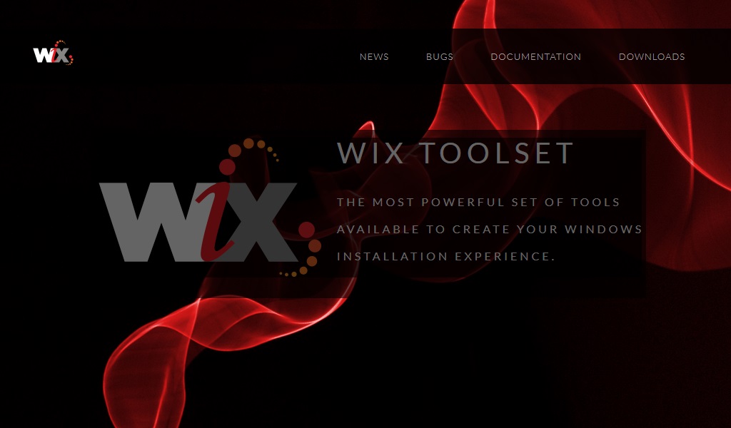
Careful readers of the WiX online meeting highlights series will have noted that not quite six months ago, during online meeting #73, Rob showed off some proposals for an updted logo for the WiX Toolset that FireGiant had commissioned. And that was the last to be heard of said logo. Until today.

WiX Web site redesign with new logo
Monday, January 4, 2016

FireGiant’s designer iterated on the logo based on feedback from Rob, me, and meeting attendees, all of whom, it’s safe to say, had opinions they were happy to voice. We had a final design fairly soon thereafter but Rob and I didn’t want to just plug the new logo into the old WiX toolset site, for a few reasons:
- The site design wasn’t mobile-friendly. (It works OK on tablets but not well at all on phones.)
- The site build was slow and had prerequisites that added overhead for someone to build and test a change to the site itself.
- The site was overdue for a freshening of the design (just like the logo).
So all we had to do was wait for Rob and me to have the spare time to redesign wixtoolset.org to solve all of those problems. And over the relative quiet and slow(er) pace of the December holidays and post New Year’s Eve recovery period, we did.